

Common pitfalls in charts and how to avoid them
Aims and Goals
Most people think charts are boring. In many ways they are but that is because they are so familiar. Hence, many data visualisation experts spend a lot of time creating “new” and never-seen-before visuals. Unfortunately such visuals require lots of mental work to understand and in many cases they are a rather ambiguous representation of the underlying data.
Therefore, I decided to write a short tutorial on how to improve every-day charts. This article explains the thinking behind the final design.
The evolution of a chart
Most people actually prefer working with
Scatter Plots
Line Charts
and Column Charts
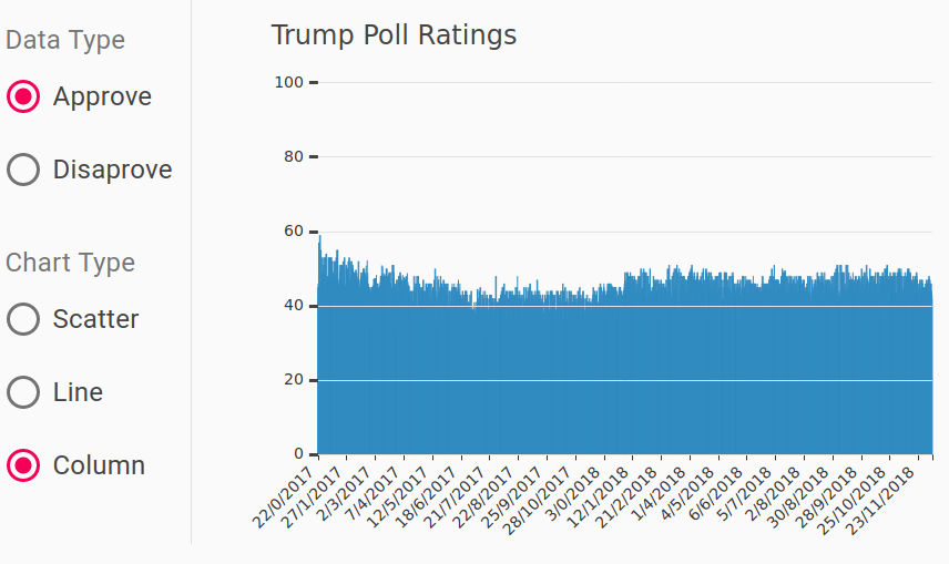
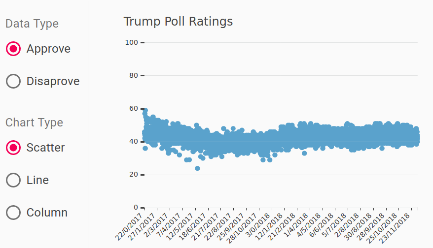
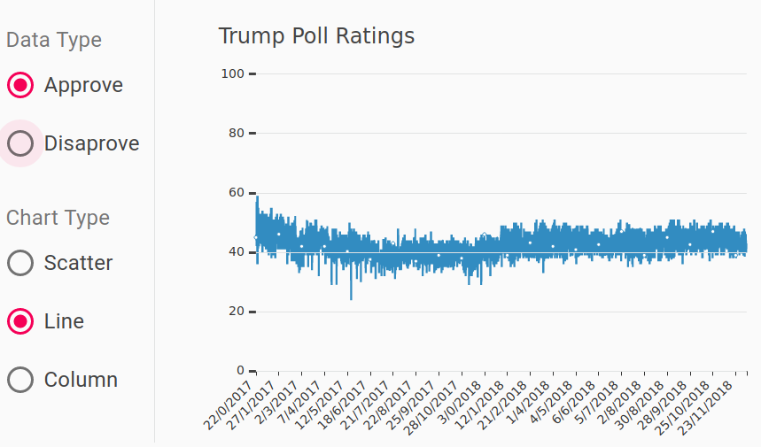
because they are easy to get and reduce the cognitive load on the reader. So let’s “prettify” a few simple charts… You can see above my first attempt to plot the approval rating of the US president using ECharts.js. The panel on the left is the corresponding UI.
I have not seen a (free) visualisation library with decent default parameters. For my initial attempt above I:
- made the x- and y- axis labels big enough to read easily;
- added horizontal tick marks from left to right on the y-axis. I love this trick because anyone looking at the chart can immediately see how the values oscillate between 40% and 60% across the entire length of the chart.
- tilt the x-axis labels at 45 degrees as opposed to the default vertical orientation. That’s again much easier to read!
- Another important thing to remember especially when displaying percentages is to show the zero on the y-axis. It is a convention that such charts are from 0 to 100 as opposed to zooming in, e.g. 20%-60% in this case. This approach makes charts comparable because the scale is always the same.
- Never forget to put a title on your chart. It is scientifically proven that readers do look at it for information about the visualisation.
There are still problems
The main defect in the plots above is called overplotting. The display area is always limited to a certain size, e.g. page or screen dimensions, which means that if there are too many data points they start to overlap .
Another problem is the high ink-to-data ratio for the column chart because each bar corresponds to a single point, meaning lots of ink per point by definition. The main idea behind this metric is that lots of colour on any visual should represent somewhat proportionally many data points. There is no exact definition of what ratio is good. I generally try reducing it whenever possible.
On the column chart everything below 40% is a slab of blue which gives us no extra information. Ultimately, column charts are not great for displaying lots of data, because columns cannot get infinitely thin and remain useful. The columns also compound the problem of overplotting by hiding any points below 40%. Hence, this option in the UI of the chart below can simply go.
Fixing overplotting in scatter plots
a. Coalesce points
Merging (very) close points in a scatter plot is an effective approach to solve overplotting. The thinking is that if two or more points are very close to each other they can be shown as one point, which can be a bad or good idea depending on the use case. For rating charts, this is not an issue because the end users typically want to see the overall trend rather than individual points. Statistically speaking a poll has at least 2% error margin so data points with almost the same value are indistinguishable. Thus, understanding the context of the visualisation is important. Coalescing points would be a bad idea if the visualisation is used to judge the data quality for instance, because the method hides data.
Pros. The great thing about coalescing data points is that it scales really well visually. There is no limit on how many points can be shown. From a computational perspective, rendering SVG graphs is limited by the number of elements on display; 1,000s of points on a scatter plot will make the browser rather sluggish. Hence, reducing the number of displayed elements is a winner.
Cons. It can be computationally expensive to calculate on the fly, though. JavaScript is good enough for moderate loads but do not even think of crunching 700 MB in the browser, though WebAssembly and workers may help you here.
b. Data shading
When merging points together it is nice to tell your users about it. Shading data in it simplest forms means playing with transparency of the shapes showing the data. For example, setting the transparency (think SVG format) to 0.1 out of 1.0 means we can plot 10 dots on top of each other and theoretically see the difference. In practice, real users can tell the difference between 3–4 shades of the same colour limiting the amount of overlap we can use.
Another version of this approach is to vary the dot size. In this case the diameter (or area) corresponds to the number of data points represented by the blob. It can work well to emphasise for instance outliers, which will be either too small or too big. For example, if a group of values are repeated multiple times in the dataset due to an error, they will stand out in this case.
c. Make the points smaller


Simple is always my first choice. The two approaches above do require extra calculations and potentially a lot of custom work, because viz libraries do not offer these option out of the box. Before investing many hours writing a lot more code just scale down the points.
Now I can see a lot of individual points which is good enough for now. The overall message of the chart is that support for the US president remained relatively stable in 2017–2018. Individual data points are nice to see but not a must and some degree of overplotting is acceptable.
The same approach did not improve the line plot, though.
Tidy up

In all fairness the x-scale was a bit cluttered… The first implementation of the chart treated the x data as categorical values, i.e. the date values can also be called a, b, c, d, e, f, g, etc. and nothing would have changed. Fixing that required re-writing how the data were parsed with JavaScript. But, the effort was worth it because the x-axis now looks as expected!
Conclusion
You can find an interactive version of the chart here.
One might wonder why I kept the line chart option in the UI. After all, the overplotting due to line overlap is significant. The lines are not very helpful but they nicely highlight any survey results that markedly deviate from the consensus. Admittedly you can see the same data points on the scatter plot but somehow it is not the same effect visually. Providing different views of the same data is often essential to data visualisation. it is rare that a single plot will capture well all aspects of a dataset.
The final result is
Before
After
My name is Nik Vaklev and I am the founder of Techccino Ltd | Data Visualisation Consulting and Software
Thanks for your blog, nice to read. Do not stop.